Here’s the thing about my art style (according to myself), I like to test different tools and methods. I can’t be a one-trick artist. However, I always fall back to certain methods because I prefer them over others, but I’m never afraid to test something new. I find that a lot of artists online stick to a certain way of drawing (or ‘arting’) because they’re comfortable with it or it’s gotten them a lot of attention so they don’t switch it up. I personally can’t do that…I find it boring and doesn’t allow for any improvement. With that said, in early 2014, I tried to make my first coloured pencil drawing of Cameron Diaz after seeing some amazing artwork online.
I use to have Hilroy colouring pencils as a kid. I think everyone had the 12 or 24 pack of colouring pencils on the first day of class and would lose half of them within a week. That’s as far as my knowledge of colouring with pencils went until 2014. I always thought great pieces were left for painters and graphite users, and that markers and colouring pencils were for children’s books. Wrong…WRONG *Charlie Murphy voice*. I had to study and watch a few artists online to understand just how useful these pencils were. I kept seeing the brand prismacolor everywhere…like there was something about that brand of pencil that made you a better artist so I obviously made sure to acquire and use those for my project. To my surprise they were just like regular Hilroy pencils, but with 64 colours instead of 12. The tools never make the artist; it’s always the technique and willingness to learn that do! But I can’t knock this brand because the pencils worked extremely well.
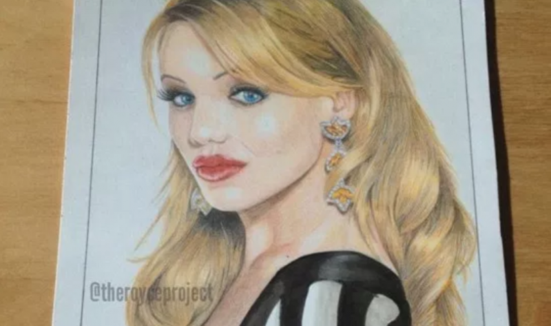
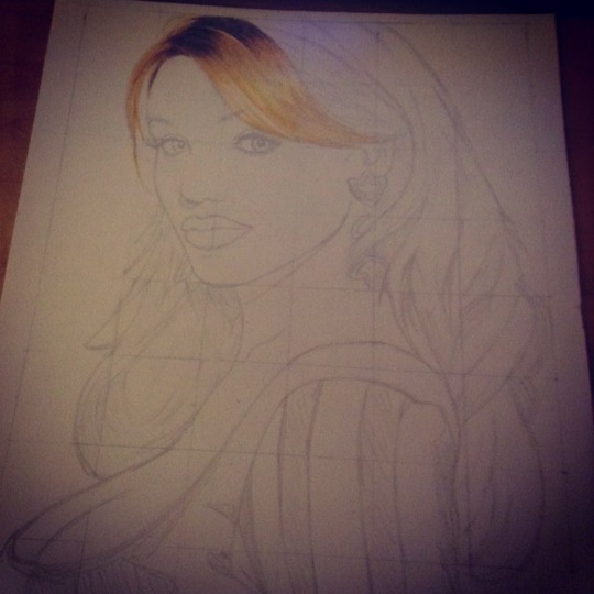
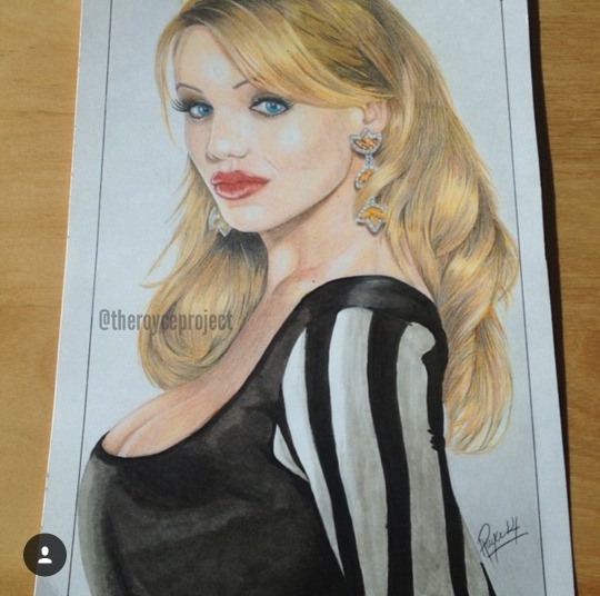
I picked a picture of Cameron Diaz (specifically from the movie The Mask) online to be the test subject of this drawing. I had to morph a more recent picture of her with the outfit from the movie because I couldn’t find a good HQ pic off google. I was debating between her and a pic of Katie Perry, reason being I wanted to test out the colours on white skin (gasp!) just to switch things up a bit. I quickly put the picture on a grid and used a cut out piece of Bristol board for paper (the Bristol works best with colouring pencils). I drew the outline of Cameron with a regular 2H pencil and prepared the piece for colouring.
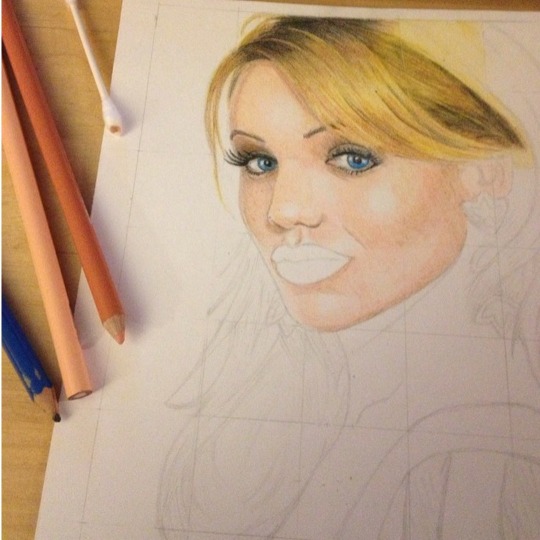
The first thing I learned was from the artist Alex Fjelnseth (IG: afjelnseth) and the lesson was to keep the pencil extremely sharp at all times. I used to think that dull colouring pencils spread out better on paper, but that’s actually not the case. What you want to do is keep the pencil extremely sharp and go over the same area over and over again. Don’t press down on the page with the pencil, but just keep going over the same area until you notice the patches of white paper disappearing. This will make the work extremely long, but the results are worth it. So I started with the hair because I knew it would be the most difficult and longest part. I used a variety of yellow, brown, red, grey, and black pencils to get the patterns I needed (unfortunately I didn’t keep track of which colours I used exactly). My biggest flaw to date as an artist is I don’t understand colours (per se). I never studied values and hues and whatever else is involved so this piece was largely based on trial and error (always keep a scrap piece of paper to test colours and blends before attacking your actual piece). I mixed the different colours until I got what I wanted with the hair. Because there was so much hair to do, I took a break and went on to another
part of the pic.
The next part was the skin. I used peach, beige, light brown, grey, and white colours to do what I needed. I’ve seen people add purple and other colours I don’t understand to get a more realistic look to white skin, but I don’t know how that works. I started with the face and left the eyes, lips, and earring untouched. Keeping the pencils extremely sharp at all times, I was able to add all the details I wanted to the skin. I later did the eyes using a few blues, pink, grey, and black pencils. Personally I think I messed the eyes up with the colour which makes Cameron look a little off. But I just Bob Ross’d through the errors and kept it moving.
I coloured past the apparent flaws and completed the lips, earrings, and neck. I used a few reds and pinks for the lips and some greys, browns, and yellows for the earrings. I later went back to complete the hair and I think I had spent over 8 hours on the hair and skin alone.
Here are a few things I have to highlight before describing the rest of the portrait. First, I studied other artists for weeks (and I seriously mean weeks) before attempting these coloured pencil pieces. I would go on their profiles and see what kind of tips they left in their captions (if they left any at all) on Instagram. I made sure to watch the progress steps to understand which sublayers they used for different skin, hair, and body part patterns. Some of these artists include IG: theillestrator (unfortunately he’s no longer online), IG: elle_wills, IG: afjelnseth (mentioned above) and IG: dinotomic. Follow these people to see just how amazing their techniques are. I swear you can learn just by observing them. Second, I didn’t know how to organize my pencils. This may sound silly, but once I figured out which colour I needed for a part of the portrait, I kept it aside. All the colours I used for the hair stayed in a bunch and all the ones for the skin stayed in another bunch and so on. This becomes a problem only when you realize that it’s gonna take you more than a day to finish the piece and when you come back to it you will have likely forgotten exactly what you used. I should have simply written down which pencils I used for which parts of the pic and kept it simple, but the laziness kicked in. The last thing to note is the importance of the scrap piece of paper. It’s absolutely critical to always use a piece of scrap during your art session, especially if it’s a new project. You never want to try out something you’re not sure of on your final piece and have everything messed up for no reason. Since I was trying something completely new, I used a scrap piece of paper to make sure everything blended accordingly. This allowed for no real errors and I essentially completed my first coloured pencil piece without flaws (except for those damn eyes!). The last part of the portrait, however, included no coloured pencils.

I saw that I only had the black and white dress to complete. I also saw that it would be useless to cover so much space with a single pencil without completely wasting it, so I went to my handy warm grey Copic markers to finish the pic. Bristol board easily absorbs markers so I didn’t have to worry about any bleeding onto my penciled areas. I just used some light greys on the white parts and dark greys+blacks on the dark parts. With these markers you sometimes have to go over the same areas over and over again once they dry just to make sure you cover every patch properly. Using the markers saved me hours and I was able to finish that portion of the picture within 30-45 minutes.
Ultimately, the project went well. I think I was able to apply what I learned from other artists effectively and come up with a decent looking portrait. Unfortunately, I don’t think I’ll ever do another coloured pencil portrait. That shit took way too long (lol). I’ve incorporated bits and pieces of the coloured pencils into mixed media artwork (either with markers or graphite pencils) but I’m not going to do any full portraits any time soon.
That’s all I have for this breakdown. Check out some of my other tutorials also!
Go check out my Instagram and Twitter.
Peace!
Royce.