Welcome to another edition of my art piece breakdowns. I’m gonna take you through the steps I took to create my Aaliyah poster. This is one of my favourite recent pieces and it’s also one where I experienced with mixing markers, pencils, and charcoal into a single work of art.
I’ve said this in earlier posts, but everything is about conceptualization. Sometimes I can start drawing an image and it takes a life of its own and becomes something great, but most times, I need to think about what I want to draw and I usually think about it for a long time (days to weeks). This Aaliyah piece was thought up maybe 2 weeks before it was drawn. I wanted to make a tribute to her life and death, but without making it look too angelic, or heavenly, because theinternet is full of those pictures.
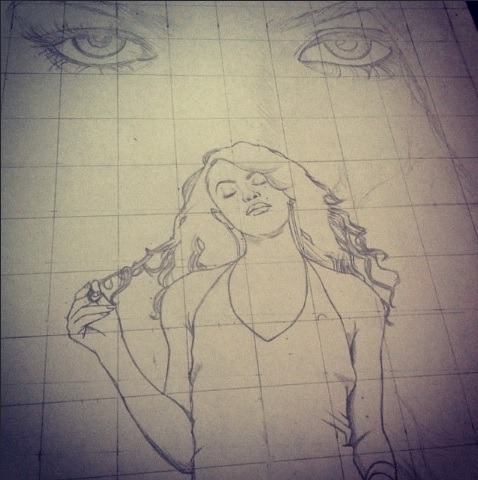
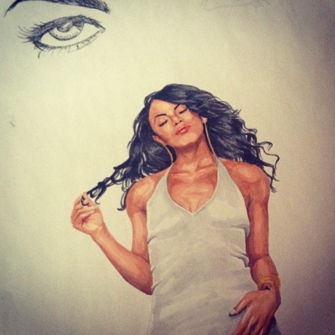
I looked all over google for pictures that would capture Ms. Haughton in a peaceful state, and one of the behind-the-scene takes from her self-titled album did just that. I also wanted to put something in the background that captured her essence, so a big pair of eyes seemed appropriate.
Like I’ve done many times before, I placed the pictures in the frame I wanted on photoshop and used that picture as a reference for my grid on my paper. I drew light outlines of Aaliyah’s body and the eyes in the background with a 2H pencil. It’s important to make sure the outline isn’t too dark. I knew from the beginning that I wanted to use markers for the bottom portion of the picture so I had to make sure the penciled outline was erasable.
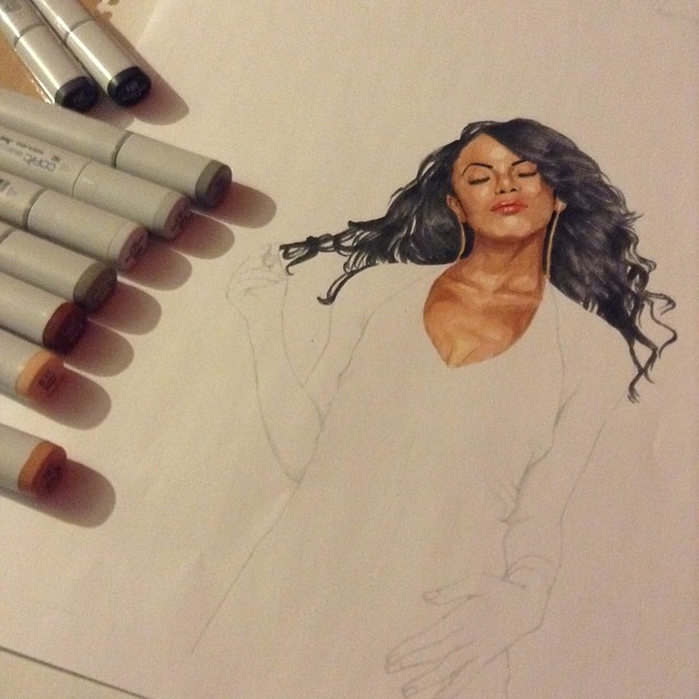
The next step was erasing the grid lines and adding colours to the picture. One of the reasons to draw the grid very lightly is to ensure that it doesn’t show up in the final picture. I’ve made drawings in the past where I either drew the grid too hard, or didn’t erase it well enough and it ruined everything (although some people thought it was just fine). Once the grid lines were gone, I used Copic markers to draw the skin and hair, as well as the dress. I used the skin tone colours E11, E13, E15 and E18 and I used the greyscale colours N0, N2, N4, N6 and N8 for the hair and dress. I coloured everything with the brush tip of the marker and tried to blend the tones as well as possible. I used the E11 markers first to colour the lighter areas of the skin, then went over those areas with the E13 marker. I let them dry a bit and did the shaded areas with the E15 marker. To finish off any very dark regions, I used the E18 marker. Looking back at the picture now, I could have blended the colours a little more smoothly, but I’m fine with the way it looks now. Using markers is different from anything else I’ve used. You can’t erase anything you do, and you also can’t make extremely fine details. The good thing is you can cover larger areas in a single stroke than you can with pencils, and you can go over the same areas to increase shade and create a cool blending effect.
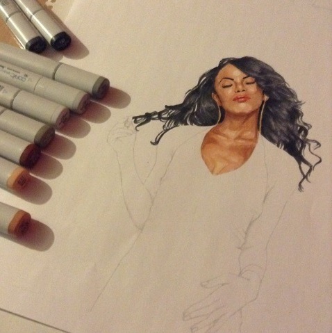
Right before getting to the hair, I used a micron pen to do some of the facial details. These pens can have extremely fine tips and dry very quickly without smudging. I used a 0.1mm pen to draw in the eyelashes, eyebrows, nostrils, and some of the hair strands around the face. I also used a red colouring pencil to colour the lips, because like I mentioned above, it’s very hard to draw small details with markers.
I coloured the hair with N2 – N8 markers. I used the N2 first to make the highlights in the hair. Since you can’t really go over dark markers with light markers, it’s easiest to do the light portions first. I then went over those areas with the N4 and N6 markers for slightly darker to even darker shades in certain areas. All while looking at the reference piece on my computer. I only used the N8 marker for very dark areas in the hair. I didn’t want the darkest marker to draw attention away from all the other details. The next part was the dress. The dress is supposed to be all white, but I used the N0 marker for shading details. The N0 is extremely light…sometimes when you use it, you can’t really see what it’s doing to the paper until it dries up and darkens just a bit. I used this marker for some light shading on the dress, and then added slightly darker details on the edges and under one hand with the N2 marker. This completes the bottom portion of the picture.
Next were the eyes and hair on the top portion of the picture. I always see great artists on Instagram draw eyes, and focus on eyes, or lips, and all these facial parts that I never
understand. I don’t see the obsession. But when it’s time for me to draw or shade eyes I wish I paid a little more attention to these people. Drawing eyes well isn’t easy. Making all the highlights and lowlights and hair details, plus making the eye look wet (or teary) isn’t easy at all. I don’t practice this enough, but if I could master it, I would be able to make this Aaliyah background come to life. I did what I could for this image with a soft charcoal and some colour pencils (prismacolor). I started with the lashes and the details outside the eyeball. I then tried to focus on all the small details inside the eye that didn’t need colour. I worked on shading the outside of the eye with charcoal and then did the eyebrows. I started with her right eye then moved to her left one. Once the eyes were done I took a yellow, a green, and a brown colour pencil and did the inside of the eye. I later moved away from the eyes and focused on the hair and shaded area around the nose.
Charcoal is usually messy. It smudges very easily on the page, on your hands or anything it touches. If you want to make sure you don’t smudge everything all over the place, put a piece of paper under your drawing hand when it comes in contact with the page you’re drawing on. Whenever you need to move your drawing hand, lift the piece of paper underneath it and place it somewhere else on your drawing page. Usually you can slide that paper under your hand as you draw, but even that will smudge charcoal. When I drew the hair details, I made sure to always move my piece of paper accordingly. At this point I was done withAaliyah, but I wasn’t done with the picture overall.
I wanted to do something that represented death and heaven, but I didn’t want to draw wings or halos, clouds, and all the other stuff that’s typically found in heavenly pictures. But still I couldn’t get away from the concept. So I decided to include what looks like feathers in the background, falling from the face and beside the bottom portion of Aaliyah. This way I can include a heavenly look, but with my own twist on it. I went back to the charcoal and started smudging the bottom portion of the page. I then smudge the lead from the bottom going upwards. This made the shading go from dark to light. I kept going until I covered the areas I wanted. Next, I used my mono-zero eraser to negatively “draw” the feathers. I was basically erasing the charcoal into feather patterns. This tool is nice for making light details on darkly shaded areas, and in this picture it was used to make wings without actually drawing them.
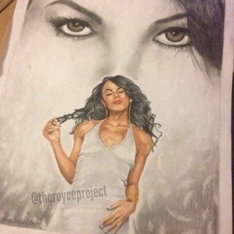
I took a few more looks on what I could improve and added a few highlights to the hair on top of the page. After a bit I just left the drawing alone. A tendency artists have is to try to improve something that’s already good. I step away from pictures very often just to create some distance and a different perspective. Then once I come back to my image, I find that it doesn’t need any additional adjustments. With that said, this Aaliyah tribute was done and ready to be framed. I keep the original posted at my place in Toronto and it’s always refreshing to look at it from up close.
That’s it for this breakdown. Make sure to follow me on Instagram (TheRoyceProject).
If you’d like a print of this picture, I sell them on my online shop.
Take it easy people,
Peace!
Royce